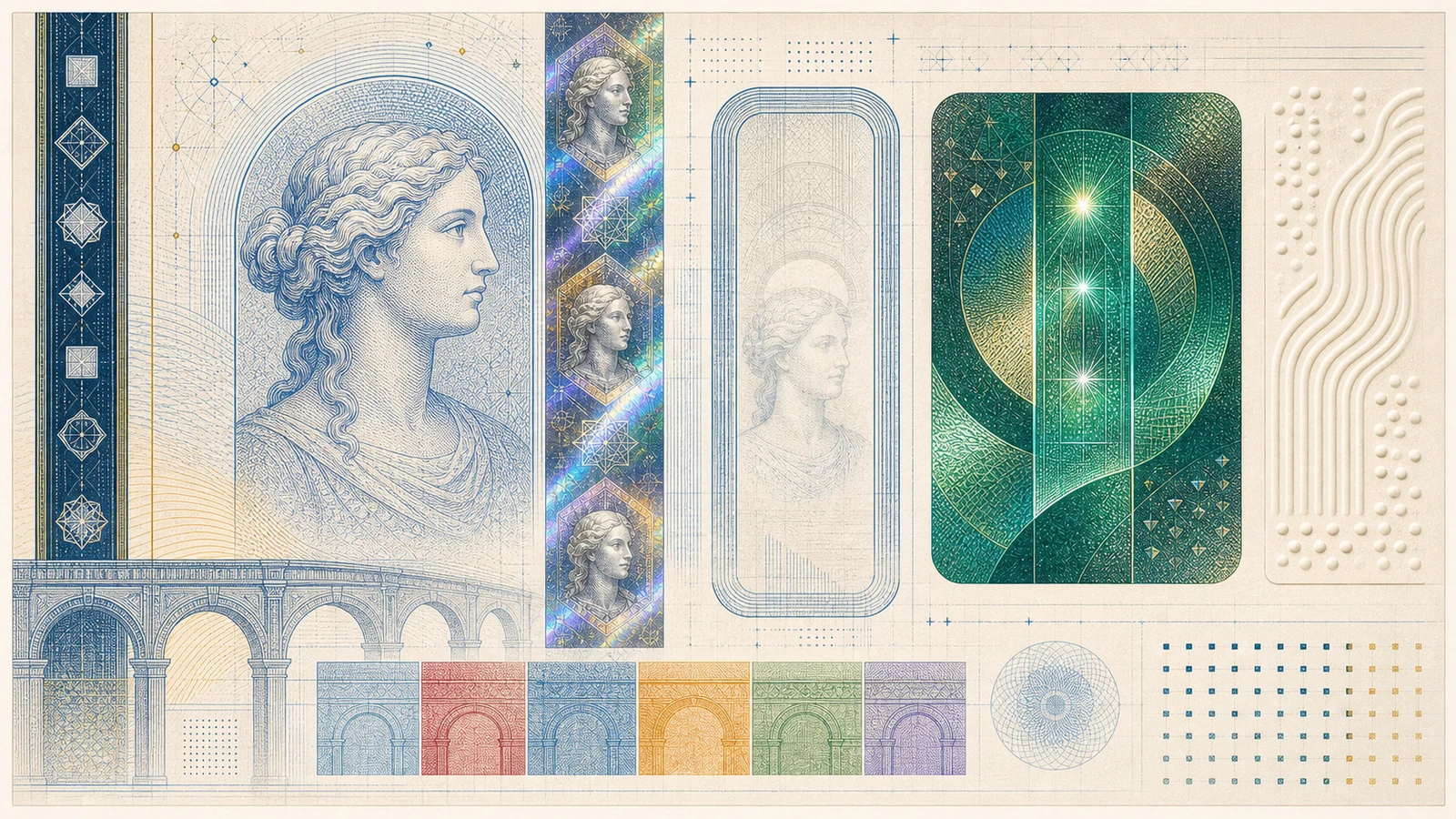
The Europa series is the current production series of euro banknotes. It keeps the shared architectural language of the first euro banknotes, but updates the security system around a new visual anchor: the portrait of Europa.
That portrait appears in security features rather than as an ordinary commemorative portrait. It is visible in the watermark and hologram, and on the 20, 50, 100 and 200 euro notes it also appears in the transparent portrait window. The result is a series that remains familiar, but is easier to explain through the public method: feel, look and tilt.
The first-series security features cover the original set; the focus here is what the Europa series changed, what it kept conceptually, and how to read the most visible features without turning a single sign into a certificate of authenticity.
The Europa feature map
The public checks for the Europa series are built around the same sequence used by the ECB for euro banknotes generally: feel, look and tilt. The details, however, are more portrait-centred than in the first series.
Most of the public-facing security signs of the Europa series cluster in the same area of every denomination: the upper-right corner of the front, where the silvery hologram strip, the portrait window and the value number all sit close together. The six crops below show exactly that area on the 5, 10, 20, 50, 100 and 200 euro notes.


The same area on the front of each Europa-series denomination — the place where the hologram strip, the portrait window and the value number live.
| Feature | How it is checked | Europa-series detail |
|---|---|---|
| Cotton paper | Feel | The banknote should feel firm and crisp, not like ordinary paper. |
| Raised print and edge marks | Feel | Raised print is combined with tactile marks near the left and right edges. |
| Portrait watermark | Look against the light | Europa’s portrait, the value and the main image become visible. |
| Security thread | Look against the light | The thread appears as a dark line with tiny value and euro-symbol elements. |
| Portrait hologram | Tilt | The silvery stripe reveals Europa’s portrait, the value and the main image. |
| Emerald number | Tilt | The shiny value number shows a moving light effect and shifts from emerald green to deep blue. |
| Portrait window | Look and tilt | On the 20, 50, 100 and 200 euro notes, part of the hologram becomes transparent. |
| Satellite hologram | Tilt | On the 100 and 200 euro notes, small euro symbols move around the number. |
The series is therefore not just “more secure” in a general way. It reorganises the public-facing signs so that the same portrait appears through several different physical behaviours: paper, light, transparency and foil.
Feel: paper, raised print and edge marks
Like the first series, Europa-series banknotes are printed on cotton paper. The feel should be firm and crisp. This material difference is still the first clue that the note is not ordinary paper.
The Europa series also strengthens tactile recognition. In addition to raised print in selected design areas, the notes have short raised lines near the left and right edges. These are not decorative. They help visually impaired people identify the banknotes by touch, and they also give ordinary users a simple tactile feature to notice before looking at the note more closely.
The 100 and 200 euro notes were designed with accessibility in mind as well. The ECB’s material on their introduction points to larger, bolder value numerals and stronger contrast, alongside the tactile marks near the edges.
Wear still matters. A heavily circulated genuine note can feel less sharp than a new one. Touch is the starting point, not the whole judgement.
Look: portrait watermark and security thread
When a Europa-series banknote is held against the light, the portrait watermark becomes visible. It shows Europa’s portrait, the value and the main architectural image.
This is one of the clearest differences from the first series. The first euro banknotes used architectural motifs and the face value in the watermark. The Europa series adds a human face, but it does so inside a security feature rather than turning the banknote into a national portrait design.
The security thread is also read against the light. It appears as a dark vertical line, and the value and euro-symbol elements can be seen in tiny white lettering. The important point for a normal user is not to memorise microscopic detail first, but to understand the behaviour: when light passes through the note, hidden elements should appear as part of the banknote, not as flat surface printing.
Tilt: portrait hologram and emerald number
The tilt check is where the Europa series becomes immediately recognisable.
On the front of the note, the silvery stripe contains the portrait hologram. When the note is tilted, the stripe reveals Europa’s portrait, the value and the main image. This gives the user a moving, angle-dependent check rather than a static printed sign.
The emerald number is another major Europa-series feature. It is the shiny value number on the front of the banknote. When the note is tilted, the number displays a light effect that moves vertically, and the colour shifts from emerald green to deep blue.
On the 100 and 200 euro notes, the emerald number was upgraded further: the ECB leaflet notes that euro symbols appear inside the number. That detail helps distinguish the later, higher Europa denominations from the earlier releases in the series.
The practical rule is simple: these features should react to movement and light. If a supposed hologram or colour-shifting element behaves like ordinary flat ink, the note deserves closer checking through official channels.
The portrait window
The portrait window is one of the most memorable additions to the Europa series. It appears on the 20, 50, 100 and 200 euro notes.
When the banknote is held against the light, the window in the hologram becomes transparent and shows Europa’s portrait. The portrait can be seen from both sides of the banknote. When the note is tilted, the window also forms part of the holographic behaviour.
The feature is easy to explain because it uses an everyday physical idea: transparency. The user does not need a machine to see that part of the note changes when light passes through it.
It is also a useful reminder that the Europa series is not identical across all denominations. The 5 and 10 euro notes belong to the same series and have the portrait watermark and portrait hologram, but they do not use the portrait window in the same way as the 20 euro and higher denominations.
| Denominations | Portrait window | Additional note |
|---|---|---|
| 5 and 10 euro | No transparent portrait window | They use portrait watermark, portrait hologram and emerald number. |
| 20, 50, 100 and 200 euro | Yes | The window becomes transparent and shows Europa’s portrait. |
The satellite hologram on the 100 and 200
The 100 and 200 euro notes completed the Europa series in 2019. They also introduced the satellite hologram, one of the most distinctive features in the current set.
The satellite hologram is located at the top of the silvery stripe. When the note is tilted, small euro symbols move around the number. The ECB’s leaflet notes that the symbols become clearer under direct light.
This feature fits the broader Europa-series logic. It does not replace the simpler checks; it adds another moving optical sign for the higher denominations. A user can still begin with paper, raised print, watermark, thread, portrait hologram and emerald number. The satellite hologram then gives the 100 and 200 euro notes an additional public-facing feature.

Europa-series 100 euro, the smaller of the two denominations whose silvery stripe carries the satellite hologram.
First series versus Europa series
The first series and the Europa series share the same basic design theme, but their security language is different enough that the series should be identified before individual features are judged.
| Question | First series | Europa series |
|---|---|---|
| Main watermark image | Architectural motif and value. | Europa portrait, value and main image. |
| Main front hologram | Stripe on 5, 10 and 20 euro; patch on 50, 100, 200 and 500 euro. | Portrait hologram in the silvery stripe. |
| Colour-shifting public feature | Colour-changing number on the higher denominations. | Emerald number across the Europa series. |
| Transparent portrait window | Not part of the first series. | Present on 20, 50, 100 and 200 euro notes. |
| 500 euro note | Included in the series. | Not included in the Europa series. |
The comparison helps avoid a common mistake: expecting every valid euro banknote to show the same security details. A first-series 50 euro note and a Europa-series 50 euro note should not be read as though they were the same design.
What the Europa redesign actually changed
The Europa series kept the architectural identity of the original notes but rebuilt much of the security language. Europa’s portrait appears in the watermark and the hologram. The emerald number replaces the colour-changing static number of several first-series denominations. The portrait window on the 20, 50, 100 and 200 brings transparency into the note itself, not only into the watermark area.
These are not cosmetic updates. They are the response to two decades of counterfeiting attempts and to advances in security printing. The ECB’s anti-counterfeiting guidance still applies: a single sign is not enough, and a suspicious note should go to a bank, the police or a national central bank rather than back into circulation.