The first euro banknotes entered circulation on 1 January 2002, but their design story began years earlier. Before the notes could become part of daily life, they had to solve a delicate cultural problem: how can a common currency feel European without looking as if it belongs more to one country than another?
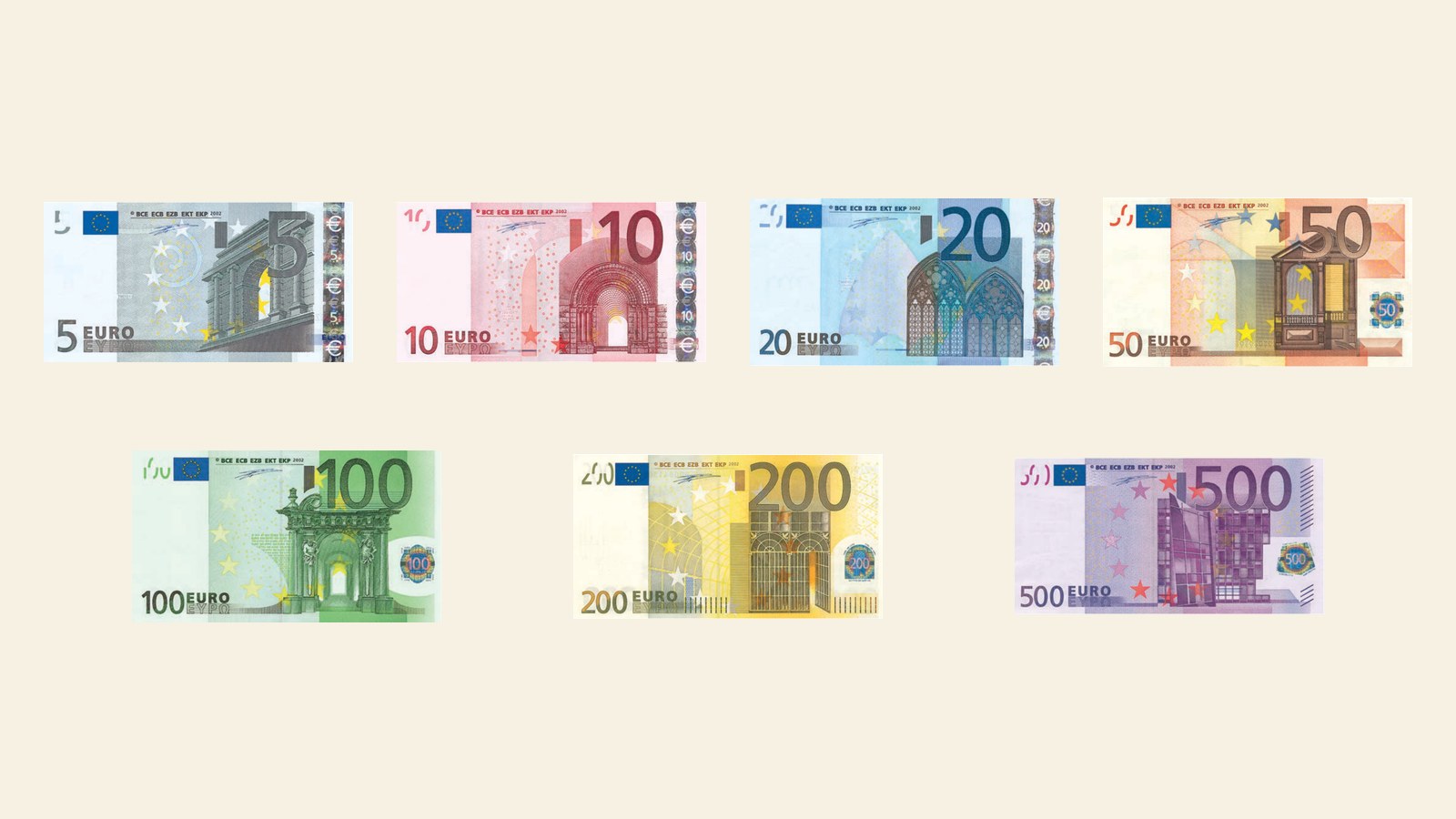
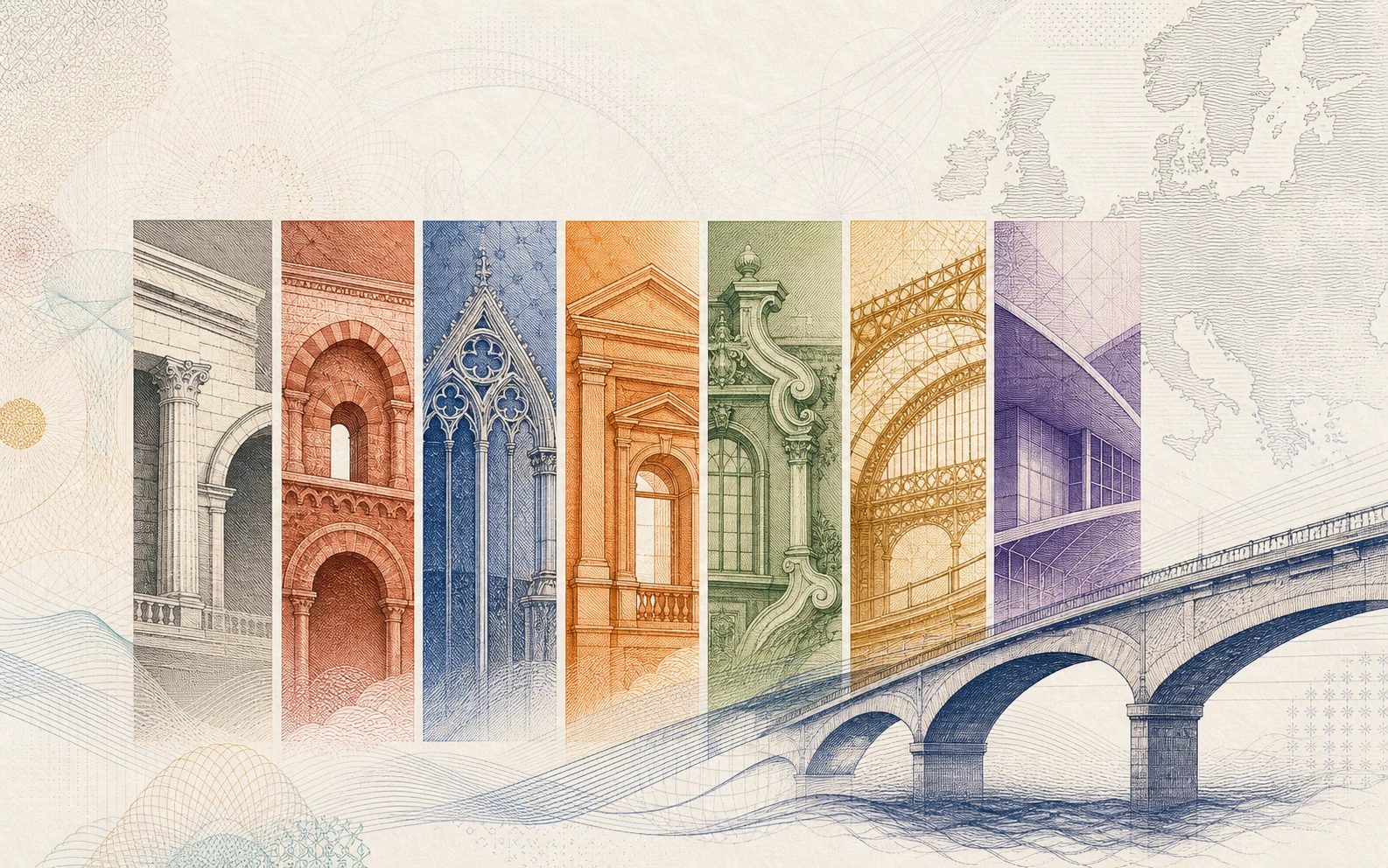
Unlike the Europa series, in circulation since 2013, the first series has no official name: it is therefore identified by the name of its theme, “Ages and styles” (“Epoche e stili” in Italian). It is a sober idea, but a very powerful one. Each denomination evokes a period of European architectural history through gateways, windows and bridges. The images are symbolic rather than documentary: they suggest a shared heritage without reproducing real monuments.
The 1996 competition and Robert Kalina
In 1995 the European Monetary Institute, the forerunner of the European Central Bank, selected two possible themes for the future euro banknotes: one abstract and modern, the other “Ages and styles”. The design competition was launched in 1996, and the selection was made from more than three hundred designs sent in from across Europe, ranging from classical and traditional subjects to modern and abstract ones.
The winning concept was produced by the Austrian designer Robert Kalina, who had worked since 1976 for the Austrian central bank (Oesterreichische Nationalbank), for which he had already designed numerous banknotes. His sketches prevailed over 43 other competitors, and the winner was proclaimed on 3 December 1996. Italy’s own proposal had been entrusted to Maestro Giovanni Pino, designer of the last 1,000-lira note, dedicated to Maria Montessori.
Kalina’s winning idea, in keeping with the terms of the competition, was to avoid profiles and faces, depicting instead gateways and windows and, above all, bridges: symbols of collaboration and openness among the peoples of Europe and towards the rest of the world.
That process matters because banknotes are not only printed objects. They are public objects. They pass through millions of hands, across borders and languages, and must be instantly recognisable, difficult to counterfeit and acceptable to the people who use them.
Windows, gateways and bridges
The front of the notes shows windows and gateways. The back shows bridges. In the ECB’s explanation, windows and doorways symbolise openness and cooperation, while bridges symbolise communication among Europeans and between Europe and the wider world.
This is one of the strongest choices in the first series. A portrait might have raised questions of nationality. A famous building could have seemed to privilege one city. The architectural language of the euro avoids that problem by using invented, representative forms.

First-series 100 euro: the front carries a Baroque window typical of seventeenth- and eighteenth-century European architecture.
The seven denominations
Each denomination has its own colour, size and architectural period. The increase in size helps distinguish the values in circulation, while the colours give the series a clear visual rhythm.


The seven first-series denominations side by side, each paired with its architectural period.
| Denomination | Dominant colour | Architectural period | First-series size |
|---|---|---|---|
| 5 euro | Grey | Classical | 120 x 62 mm |
| 10 euro | Red | Romanesque | 127 x 67 mm |
| 20 euro | Blue | Gothic | 133 x 72 mm |
| 50 euro | Orange | Renaissance | 140 x 77 mm |
| 100 euro | Green | Baroque and rococo | 147 x 82 mm |
| 200 euro | Yellow-brown | 19th-century iron and glass architecture | 153 x 82 mm |
| 500 euro | Purple | Modern 20th-century architecture | 160 x 82 mm |
The 500 euro note belongs to the first series, but it is not part of the Europa series in active issuance. For this reason it has a particular place in the visual memory of the euro: still recognisable, still part of the original design story, but separate from the current set of denominations most people encounter.
Other visible design signs
The first series also had to work across languages and alphabets. The name of the currency appears in Latin and Greek alphabets, as EURO and EYPΩ. Near the top edge, on the centre-left, the initials of the European Central Bank appear in five variants — BCE, ECB, EZB, EKT and EKP — flanked on the left by the copyright symbol ”©” and on the right by the year of the series’ first issue, 2002.
On the back, on the centre-right, a map of Europe is shown in the note’s predominant colour. Because of the chosen scale — between roughly 1:80,000,000 and 1:90,000,000 — and the offset printing process, islands smaller than 400 km² were left off the map.
These details are easy to overlook, but they are part of the same design logic. The note is not speaking from one national centre. It is presenting itself as a shared instrument of the euro area.
A choice that became normal
For most people who handle euro banknotes today, the architectural language no longer feels like a design choice. Windows, gateways and bridges have become part of how euro cash looks, the way portraits or coats of arms used to belong to national currencies.
That quiet acceptance is the measure of how well the answer worked. The first series did not need to invent a European face. It used a vocabulary that could carry a shared identity without picking a single national one, and that vocabulary is what later series have refined rather than replaced.