
The first euro banknotes were introduced in 2002 as a complete system: seven denominations, one shared design language and a layered set of security features that could be checked by people and machines.
The basic public method is still the ECB’s familiar sequence: feel, look and tilt. Here the focus narrows to the first series alone: what each feature does, where the most important differences sit between lower and higher denominations, and why a single detail should never be treated as proof on its own.
The purpose is educational and numismatic. It is not a counterfeit-detection manual. A suspicious banknote should be handled through a bank, police authority or national central bank, not judged from one online checklist.
The first-series feature map
The first series combines visible, tactile, optical and machine-readable ideas. Some are meant for everyday users; others are more useful to collectors, cash handlers and people studying the technical construction of the note.
| Feature | How it is checked | First-series detail |
|---|---|---|
| Cotton paper | Feel | Firm, resilient paper made from cotton fibres, not ordinary paper. |
| Raised print | Feel | Intaglio-printed areas can be felt, especially on fresh or lightly circulated notes. |
| Watermark | Look against the light | The left-side watermark shows the architectural motif and the face value. |
| Security thread | Look against the light | A dark vertical line appears, with the denomination and the word EURO inside it. |
| Hologram | Tilt | Lower denominations use a vertical stripe; higher denominations use a patch. |
| Glossy stripe or colour-changing number | Tilt | The 5, 10 and 20 euro notes have a glossy stripe; the 50 to 500 euro notes have optically variable ink. |
| UV fibres and fluorescent inks | Specialised light | Fibres and selected printed elements fluoresce under ultraviolet light. |
The important habit is to read the features together. A genuine banknote is not just a picture with one hidden sign. It is a layered object: paper, print, light, movement and position all work together.
Paper and raised print
The first layer is the material itself. First-series euro banknotes are printed on high-quality cotton paper. This gives them a firmer, more resistant feel than common writing or photocopy paper.
That tactile character matters because the banknote has to survive circulation while remaining readable. A note that feels limp, waxy or unusually smooth is not automatically counterfeit, but it deserves closer inspection through the other checks.
Raised print is the second tactile clue. The first series uses intaglio printing on important areas of the front, including the main architectural motif, the large face value and the ECB initials. On fresh notes, these areas can be felt by lightly passing a fingertip over the surface.
Wear changes this experience. A heavily circulated genuine banknote may lose part of its tactile sharpness. That is why touch should begin the check, not finish it.
Watermark and see-through number
The watermark is the most widespread security feature on banknotes and documents: born in Italy at the end of the 13th century, it has been used for decades on almost all of the world’s banknotes. When a first-series banknote is held against the light, it becomes visible on the left side. In the unprinted area, it shows two main elements: the architectural gateway connected to that denomination, which repeats part of the design on the front, and, below it, the face value. Moving to the right, in the printed area, a few vertical bands appear: three on the 5 and 10 euro notes, four on the 20, 50, 100, 200 and 500 euro notes.
The watermark is not supposed to look like a flat printed patch. It should appear integrated into the paper, with soft transitions between lighter and darker areas. This is one of the reasons watermarks have remained important in banknote design for so long: they belong to the substrate, not only to the surface image.
The see-through number works differently. Parts of the face value are printed on the front and corresponding parts are printed on the back. When the note is viewed against the light, the fragments align to form a complete number.
The security thread
The security thread is another feature read against the light. On first-series euro banknotes it appears as a dark vertical line placed toward the centre-left of the note.
The thread is about 1 mm wide on all denominations. Inside it are the denomination and the word EURO. This makes it more than a dark line: it is also a tiny embedded inscription.
The thread position changes with the denomination because the notes increase in size. The same source gives the following approximate positions:
| Denomination | Approx. from left edge | Approx. from right edge |
|---|---|---|
| 5 euro | 51 mm | 68 mm |
| 10 euro | 58 mm | 70 mm |
| 20 euro | 59 mm | 73 mm |
| 50 euro | 60 mm | 79 mm |
| 100 euro | 64 mm | 82 mm |
| 200 euro | 68 mm | 84 mm |
| 500 euro | 72 mm | 87 mm |
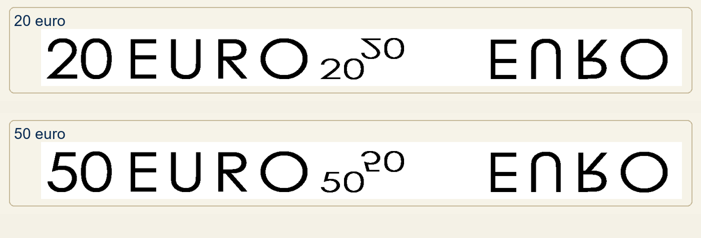
First-series security-thread inscriptions on 20 and 50 euro details from Gerardo’s source material, shown as visual references alongside the position table.
For ordinary users, the exact millimetres are less important than the behaviour: the thread should become visible when light passes through the note. For collectors, the measurements are useful because they show how the same feature was adapted to seven different formats.
UV fibres and fluorescent details
Ultraviolet light is not part of the simplest public check, but it is an important part of the first-series security system.
The cotton paper contains small fluorescent fibres. They are green, blue and red, spread across the front and back of the banknote and roughly 3 mm long. Under UV light, these fibres become visible as small coloured strands.
Other selected elements also react under ultraviolet light. In a dark environment, the EURion constellation (orange), the European flag in the top left (green background with orange stars), the ECB President’s signature (green) and some of the stars (orange) all become visible. Checking the fluorescence, the colours and the position of these elements contributes to verifying authenticity.
The EURion constellation, also known as the “digital watermark”, has a further function: contained within the offset-printed background, it is recognised by many image-acquisition programs, which for this reason refuse to scan or reproduce euro banknotes.
This is a good example of how security features work in layers. A person paying in a shop may use feel, look and tilt. A cash handler or specialist can add controlled-light checks. The two levels support each other, but they are not the same task.
Tilt: stripe, hologram and colour shift
The tilt check is where the first series separates the lower and higher denominations most clearly.
The 5, 10 and 20 euro notes have a glossy stripe on the back. When tilted, the stripe reveals the face value and the euro symbol. The stripe is about 8 mm wide on the 5 and 10 euro notes and about 9 mm wide on the 20 euro note.
All first-series notes also have a hologram on the front. The 5, 10 and 20 euro notes use a continuous vertical hologram stripe. The 50, 100, 200 and 500 euro notes use a single hologram patch near the right edge, in the lower half of the note.
The holographic images change with the denomination. On the 5, 10 and 20 euro notes they alternate two images: the face value with the euro symbol ”€” and the face value with the twelve stars of the European flag. On the 50 to 500 euro notes they instead show the face value, the gateway of the same type as the printed one, and the repeated inscriptions “EURO” and “EYPΩ”.
On the higher denominations, the back of the note adds a colour-changing number. The face value in the lower right is printed with optically variable ink, changing appearance when the banknote is tilted under light. The effect shifts between purple, brown and green depending on the angle and lighting.
| Denominations | Hologram format | Back-side tilt feature |
|---|---|---|
| 5, 10 and 20 euro | Vertical hologram stripe | Glossy stripe with value and euro symbol |
| 50, 100, 200 and 500 euro | Hologram patch | Colour-changing value number |
This difference is useful because it keeps the explanation manageable. The first series is one system, but it is not identical across all values.
Printing techniques behind the features
Some first-series security features are visible because of what is printed. Others are visible because of how they are printed.
Offset printing is used for large, flat areas of the design, including background elements that do not have tactile relief. This includes many of the broad visual components such as stars, bridges and map-related background elements.
Intaglio printing creates raised ink. It gives selected areas a tactile quality and helps the front of the banknote feel different from ordinary flat print. This is especially important on the main architectural motif, the large value numeral and the ECB initials.
The serial numbers are added by typographic printing on the back. On fresh or lightly circulated banknotes, the numbering can leave a subtle pressure effect that may be felt or seen from the opposite side.
These production differences matter because they prevent the banknote from being reduced to a flat image. A first-series note is built from several printing and material layers, not just one visual design.
A careful first-series check
The first series is no longer the only euro banknote series people encounter, but it remains legal tender and it remains central to understanding euro cash. It is also the series that introduced the original security language later refined by the Europa series security features.
For collectors, the first step is to identify the series and denomination before judging any feature. A 20 euro note and a 200 euro note do not present the same hologram format or back-side tilt feature. A worn note may not feel like a fresh note. A single correct-looking feature does not authenticate a banknote by itself.
That is the useful way to approach first-series security: not as a hunt for one magic sign, but as a reading method. Material, light, movement, fluorescence and print all contribute a piece of evidence. Together, they explain why the first euro banknotes were not just a new design in 2002, but a technical object built for trust.

